A Comprehensive Guide to Using AG......
A Comprehensive Guide to Using AG Grid in Angular
What is AG Grid?
AG Grid is a flexible data grid component for Angular and other web frameworks. It allows developers to create highly interactive and customizable tables that can display complex data and offer advanced user interactions. AG Grid supports many features such as:
- Sorting and filtering
- Pagination
- Row grouping
- Pinning and resizing columns
- Server-side data management
Let’s dive into setting up AG Grid in an Angular application.
Step 1: Setting Up an Angular Project
First, let’s set up an Angular project. If you don’t already have one, you can create a new project using Angular CLI:
ng new my-ag-grid-app
cd my-ag-grid-app
After that, install the AG Grid package and its Angular-specific library:
npm install ag-grid-community ag-grid-angular --save
This will install the AG Grid core and the Angular integration library.
Step 2: Configuring AG Grid in Angular
Import AG Grid in the Angular Module
In your Angular module, import AgGridModule and add it to the imports array of the @NgModule decorator. This allows you to use AG Grid components throughout your app.
import { NgModule } from '@angular/core';
import { BrowserModule } from '@angular/platform-browser';
import { AppComponent } from './app.component';
import { AgGridModule } from 'ag-grid-angular';

@NgModule({
  declarations: [AppComponent],
  imports: [
    BrowserModule,
    AgGridModule.withComponents([]) // Register AG Grid components
  ],
  providers: [],
  bootstrap: [AppComponent]
})
export class AppModule {}
Adding AG Grid to the Template
In the main component template, add the ag-grid-angular component. You’ll also define the necessary configurations such as column definitions and row data.
<ag-grid-angular
  style="width: 100%; height: 500px;"
  class="ag-theme-alpine"
  [rowData]="rowData"
  [columnDefs]="columnDefs"
  [defaultColDef]="defaultColDef"
  [pagination]="true">
</ag-grid-angular>
In the above code:
rowDatacontains the data to be displayed.columnDefsdefines how columns will behave.- The grid's theme (
ag-theme-alpine) is applied via CSS. - Pagination is enabled with
[pagination]="true".
Setting Up Component Logic
In the main component's TypeScript file, define your grid’s column definitions and data.
import { Component } from '@angular/core';

@Component({
  selector: 'app-root',
  templateUrl: './app.component.html',
  styleUrls: ['./app.component.css']
})
export class AppComponent {
  columnDefs = [
    { headerName: 'Make', field: 'make' },
    { headerName: 'Model', field: 'model' },
    { headerName: 'Price', field: 'price', sortable: true, filter: true }
  ];

  rowData = [
    { make: 'Toyota', model: 'Celica', price: 35000 },
    { make: 'Ford', model: 'Mondeo', price: 32000 },
    { make: 'Porsche', model: 'Boxster', price: 72000 }
  ];

  defaultColDef = {
    sortable: true,
    filter: true
  };
}
columnDefs: Defines the columns for the grid. Thefieldattribute specifies the property name from therowDatato display.rowData: The data set to be displayed in the grid.defaultColDef: Provides default configurations for all columns (e.g., enabling sorting and filtering).
Step 3: Enabling Sorting and Filtering
AG Grid comes with sorting and filtering built-in. In the example above, we enabled sorting and filtering in the defaultColDef. You can also configure these options at the individual column level:
this.columnDefs = [
  { headerName: 'Make', field: 'make', sortable: true },
  { headerName: 'Model', field: 'model', sortable: true, filter: true },
  { headerName: 'Price', field: 'price', sortable: true, filter: true }
];
This will allow users to sort by clicking on the column headers and filter by entering text or selecting options, depending on the column type.
Step 4: Pagination
AG Grid supports pagination for large datasets, reducing the load on the DOM. To enable pagination, add [pagination]="true" to the grid component in the template:
<ag-grid-angular
  [rowData]="rowData"
  [columnDefs]="columnDefs"
  [pagination]="true">
</ag-grid-angular>
To control the pagination size, you can pass the paginationPageSize attribute:
<ag-grid-angular
  [rowData]="rowData"
  [columnDefs]="columnDefs"
  [pagination]="true"
  [paginationPageSize]="10">
</ag-grid-angular>
Step 5: Adding Themes
AG Grid offers multiple themes, such as Alpine, Balham, and Material. To apply a theme, you must reference it in your styles.css and add it as a class to the ag-grid-angular component:
@import "~ag-grid-community/styles/ag-theme-alpine.css";
Then, apply the theme in the template:
<ag-grid-angular
  class="ag-theme-alpine"
  style="width: 100%; height: 500px;"
  [rowData]="rowData"
  [columnDefs]="columnDefs">
</ag-grid-angular>
Step 6: Advanced Features
Cell Rendering
You can create custom cell renderers to display complex content. For example, you might want to display buttons, images, or even Angular components inside a cell. To create a custom renderer, you’ll need to define a cellRenderer function for a column.
this.columnDefs = [
  { headerName: 'Actions', field: 'id', cellRenderer: this.actionCellRenderer }
];

actionCellRenderer(params: any) {
  return `<button (click)="onEdit(${params.data.id})">Edit</button>`;
}
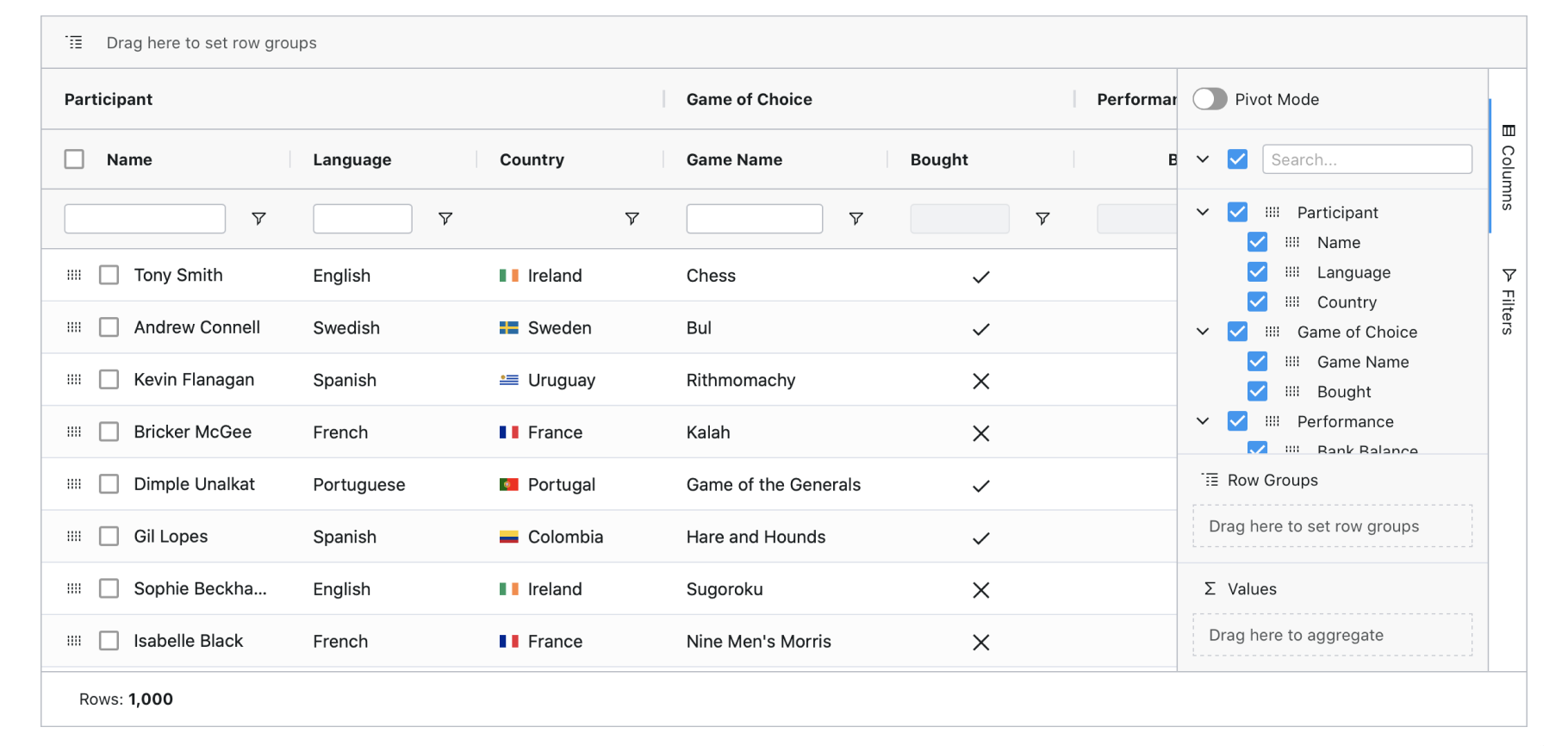
Row Grouping and Aggregation
AG Grid also supports row grouping, which is useful for grouping data and performing aggregation:
this.columnDefs = [
  { headerName: 'Make', field: 'make', rowGroup: true },
  { headerName: 'Model', field: 'model' },
  { headerName: 'Price', field: 'price', aggFunc: 'sum' }
];