CSS Grid: Designing Complex Layouts Made......
CSS Grid: Designing Complex Layouts Made Easy
CSS Grid is another powerful layout system in CSS, complementing Flexbox by offering a more robust way to create complex, two-dimensional layouts. While Flexbox is ideal for distributing items along one axis (either horizontal or vertical), CSS Grid allows for both row and column alignment, making it perfect for designing grid-based layouts. In this blog post, we'll dive into the fundamentals of CSS Grid and explore how it can be used to create sophisticated web layouts.
Understanding CSS Grid
CSS Grid is a two-dimensional layout system that works with rows and columns. It enables developers to define explicit grid containers and place grid items into specific grid cells. This makes it easier to design complex layouts without relying on floats, positioning, or inline-block.
Key Concepts of CSS Grid
- Grid Container and Grid Items:
- Similar to Flexbox, the grid container is the parent element, and all its children become grid items. To create a grid container, you apply
display: grid;to the parent element. - Example:
css
Copy code
.grid-container {
  display: grid;
}
- Grid Tracks, Grid Lines, and Grid Cells:
- A grid track is the space between two grid lines, forming the columns and rows.
- Grid lines are the dividing lines between columns and rows.
- A grid cell is the space between four grid lines, forming the smallest unit of the grid.
- Defining Grid Columns and Rows:
- The
grid-template-columnsandgrid-template-rowsproperties define the number and size of columns and rows in the grid. - Example:
css
Copy code
.grid-container {
  grid-template-columns: repeat(3, 1fr); /* Three equal-width columns */
  grid-template-rows: auto; /* Rows adjust to content */
}
- Placing Grid Items:
- You can control where grid items are placed using properties like
grid-column,grid-row,grid-area, etc. - Example:
css
Copy code
.item1 {
  grid-column: 1 / 3; /* Span item from column 1 to 3 */
  grid-row: 1 / 2;    /* Span item from row 1 to 2 */
}
- Gap Between Grid Items:
- The
grid-gapproperty defines the space between grid items. - Example:
css
Copy code
.grid-container {
  grid-gap: 10px;
}
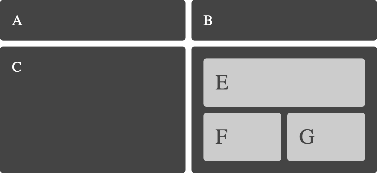
Building a Complex Layout with CSS Grid
Let’s create a complex grid layout with a header, sidebar, main content area, and a footer.
html
Copy code
<div class="grid-container">
  <header>Header</header>
  <aside>Sidebar</aside>
  <main>Main Content</main>
  <footer>Footer</footer>
</div>
css
Copy code
.grid-container {
  display: grid;
  grid-template-columns: 200px 1fr;
  grid-template-rows: auto 1fr auto;
  grid-template-areas:
    "header header"
    "sidebar main"
    "footer footer";
  height: 100vh;
}

header {
  grid-area: header;
  background-color: #333;
  color: white;
  text-align: center;
  padding: 1rem;
}

aside {
  grid-area: sidebar;
  background-color: #444;
  color: white;
  padding: 1rem;
}

main {
  grid-area: main;
  padding: 1rem;
}

footer {
  grid-area: footer;
  background-color: #333;
  color: white;
  text-align: center;
  padding: 1rem;
}